
Exploring Monthly Temperature & Precipitation Data with Climographs
Learning Objectives
Objectives include:
- Students will be able to read and interpret climate data from a graph known as a climograph.
- Students will identify regional patterns of temperature and precipitation in large urban areas from climate data.
- Students will be able to differentiate between weather and climate by working with the data from the climograph.
A secondary objective includes building the geographic literacy of students through knowing the location of urban centers of the United States.
Standards Addressed
PA Standards
3.3.5.A5
Differentiate between weather and climate
3.3.4.A5
Identify weather patterns over time
3.3.3.A4
Connect various forms of precipitation to the weather in a particular place and time
3.3.10.A6
Interpret meteorological data to describe/predict weather
NGSS
ESS2-C
Movement of water in the atmosphere determined by winds, landforms, ocean temperature and currents, are major determinants of local weather patterns.
3-ESS2-1.
Represent data in tables and graphical displays to describe typical weather conditions expected during a particular season. Scientists record patterns of the weather across different times and areas so that they can make predictions about what kind of weather might happen next.
3-ESS2-2.
Obtain and combine information to describe climates in different regions of the world. Climate describes a range of an area's typical weather conditions and the extent to which those conditions vary over years.
Supplies/Materials/Articles Needed
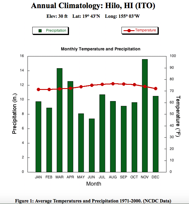
Files needed for the exercise are attached. Climographs that teaches can select from can be found on the Selected U.S. Cities page and Selected International Cities page. Teachers may want to have a map available to show students where the cities are located - this can be done before or after the students work with the climographs.
Websites that will be useful for teachers to review include:
- National Drought Mitigation Center
- NDMC - What is Climatology?
- NDMC - Types of Drought
- NDMC - Drought for Kids
A video from CoCoRaHS - Assessing Drought in the United States - that can be an introduction for students (if the video does not play, it is available on the Drought for Kids website linked above).
Additional exercises with climographs can be found at the SERC EarthLabs website - Lab 3, Normal Climate Patterns.
Preparation Time Needed
If teachers use this included exercise, the time for preparation will include printing off the climographs for students to use and the grid for students to fill in their responses. It is suggested that the climographs are printed in color, or at least project one of the climographs for students to see which data should be connected to which y-axis. If teachers decide to select different graphs than the ones included here, it will take a limited amount of additional time. This collection of graphs were chosen to reflect cities that I believe my students would know where they are located and have a general idea of the temperature and precipitation patterns.
Class Time Required
It depends how much of the exercise a teacher wants to complete is how much class time it will take. A teacher can show one climograph at the beginning of a class period as an "Image of the Day" exercise and ask students to individually or in groups to interpret the graph. If a teacher introduces how to read climographs to students and completes the attached exercise, whee students fill out the grid, this may take as long as 50 minutes. Teachers have the option to reduce the number of graphs that students examine, and/or add some international climographs for comparsion or for an extension exercise as homework.
Activity Description
Goal: Students will understand the difference between climate and weather by exploring various urban center climographs of the United States.
This activity has students engage with authentic data collected and utilized by scientists. To understand climate at a particular location, scientists may look at a graphical representation of rainfall and temperature data (instead of a table of data). This graphical representation is called a climograph. For this exercise, students are given a series of climographs for U.S. cities and a list of U.S. cities to try to match which city has which climate record (the monthly data in these graphs are averaged from 1971-2000). The questions in the worksheet are posed in a way to help the students relate the quantitative values to their daily lives (for example, would you play ice hockey indoors or outdoors?).
It is recommended that teachers begin with a walk-through of a climograph as a group, to ensure that students are reading the graph properly. An example stand-alone graph is provided. Then, students can fill out the worksheet. The cities students are trying to match with the climographs are, in alphabetical order, Boston, Chicago, Los Angeles, Miami, Philadelphia, Phoenix, and Seattle.