
The Power of a Hurricane: Using Memorable Storms to Teach Inference and Graphing Skills
Learning Objectives
The three overarching goals of this lesson are:
making inferences from scientific data
plotting data
learning how meteorological observations at a location change as a hurricane approaches and then leaves the region
Standards Addressed
3.3.12.A1
3.3.10.A6
3.3.12.A7
CC.2.1.HS.F.3
CC.2.4.HS.B.1
CC.2.4.HS.B.2
Preparation Time Needed
2 hours may be required for data collection and creation of a graphing template at the advance middle school or applied-level high school. For college level juniors and seniors who will be collecting the data and graphing on their own, this prep time becomes <30 minutes.
Activity Description
Using real-time or near-real-time data in the classroom can form the basis for exciting guided inquiry lessons that build necessary scientific thinking skills. Choosing data from recent newsworthy events also motivates students to learn because they feel personally connected to the observations surrounding such events. The lesson presented here challenges students to collect a variety of types of near-real time authentic meteorologic data associated with a memorable hurricane of their choice, to decide how to best display that data to facilitate interpretation, and finally to interpret the multiple datasets in order to draw conclusions about how meteorological conditions change as a hurricane approaches and passes by a weather station.
The Lesson
To begin the lesson, students are presented with a question to stimulate their interest: How could the location of a hurricane be determined without access to radar or satellite images? After a brief brainstorming session, the students attack the general question by investigating a specific case.
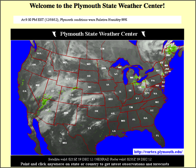
Each student studies a historic hurricane by analyzing the weather records of the storm. Several websites, primarily those of university meteorology departments, make data archives freely available online. Plymouth State University’s website (http://vortex.plymouth.edu/myo/sfc/statlog-a.html) provides an easy-to-search archive with hourly data for nearly two thousand cities in North America going back to 1998 [see first attached image].
Students visit the archives and access the data for a station near their chosen storm on the day of the event. Because not all weather stations are able to report complete records during hurricanes, it may be beneficial to direct students to certain stations for a given storm. Once they have accessed the site, students will see the data in text format; they must copy and paste that text into a spreadsheet program such as Excel. At this point, some data formatting is required. If teachers have a concern about the ability of their students to format the data, they can pre-format the table and make a file available for their students. Alternatively, for advanced students, to keep the authenticity of accessing the data online, consider providing a macro or short program that does the formatting for them.
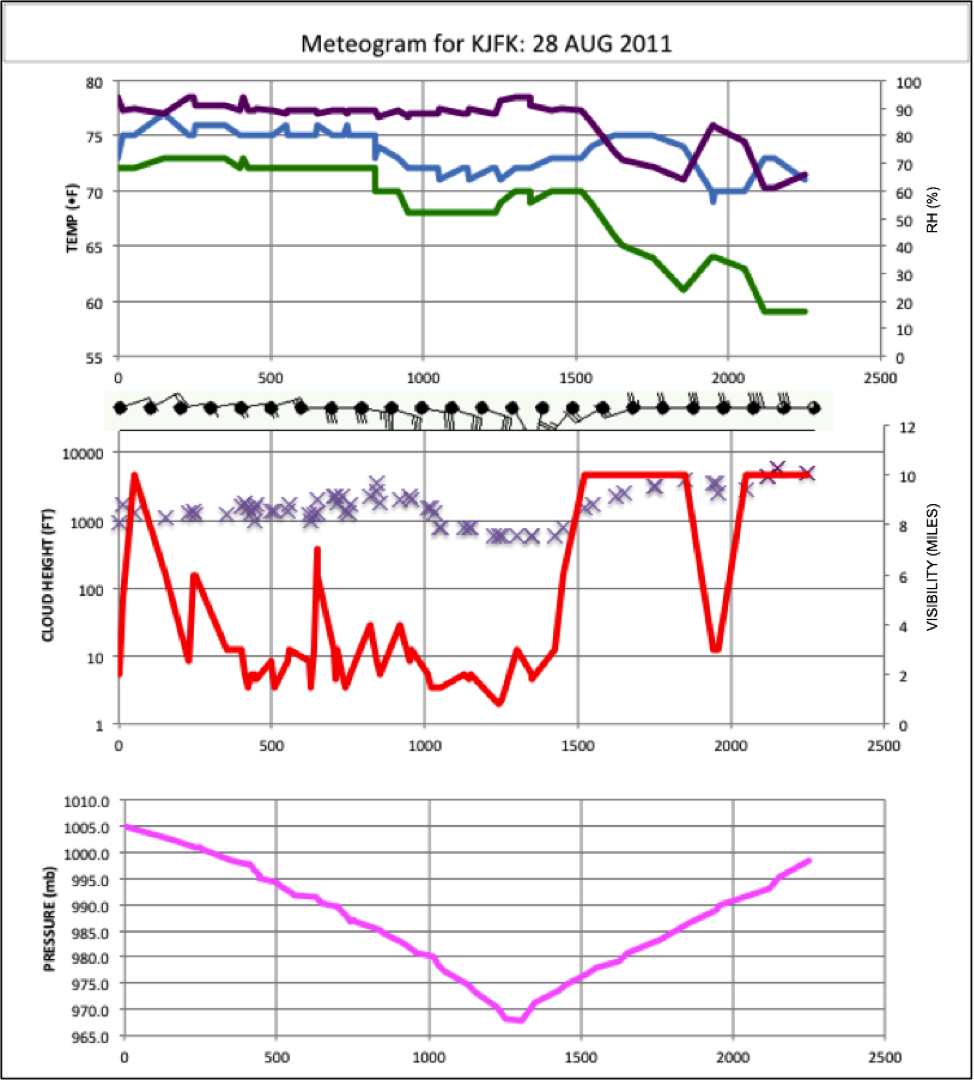
Once students have the data in a usable format, they begin the graphing process. Meteograms include three separate graphs and several weather symbols, all plotted as a function of time, for a single 24-hour period. Meteograms do follow a standard format [see second image attached below], but students should be encouraged to experiment with different ways of displaying the multiple datasets they have acquired. Engaging in plotting experimentation is an important part of developing scientific inquiry skills and it also helps students think about the importance of clear and coherent plots as scientific communication tools (Tufte, 2001). Students can be guided towards producing a meteogram in standard format, in which the first graph plots temperature, dew point and relative humidity on a single panel [see second image attached below]; the second graph shows both visibility and cloud ceiling; and the third plots barometric pressure. Also included are symbols for cloud cover, wind speed and direction, and precipitation. These symbols require drawing by hand, so a file can be provided to students with them pre-drawn, or the students can annotate their completed meteogram after printing it.
Next, the completed meteogram is used to analyze the storm. Students can then be given a worksheet [see second image below for a sample worksheet] that asks them to identify trends with respect to time for the observations of temperature, pressure, cloud cover, and the other data.. They are also asked to look for correlations among different types of data, for example, whether wind speed and pressure change simultaneously or whether the change in one observation lags the other.
When students analyze trends in wind, they are led back to the original motivating question about hurricane location. By looking at both wind speed and direction and applying their knowledge of the rotation of low-pressure systems, they can generate a claim regarding the position of the eye and support their claim with their evidence and reasoning. They are specifically asked to identify the time they believe the eye of the storm was closest to the weather station and the position of the storm at that time. Once students have generated their claim, they share their hypothesis with the teacher before checking their hypothesis against additional data.
The final step of this lesson is for students to investigate the actual path their storm took. Through an internet search, students can find maps for most historic storms. They then compare their claim about the storm’s position to its actual movement and explain any possible causes for error in their claim. This activity leads into good class discussion of student results and any lessons and/or skills learned.
Complete caption for second figure below: Sample 24-hour meteogram generated in this lesson for station KJFK (New York City). Top panel shows Temperature (blue) and dew point (green) in degrees F and relative humidity (purple) as a percentage. Middle panel plots cloud height (x’s) in feet and visibility (red line) in statute miles. Bottom panel plots barometric pressure in millibars. Symbols in between the top and middle panel indicate wind speed and direction.